Second-Look Financing at Self-Checkout
Turning a dead end into a second-chance financing path.
Role
Year
Timeline
Impact
Lead
UX Designer
2024
12 weeks
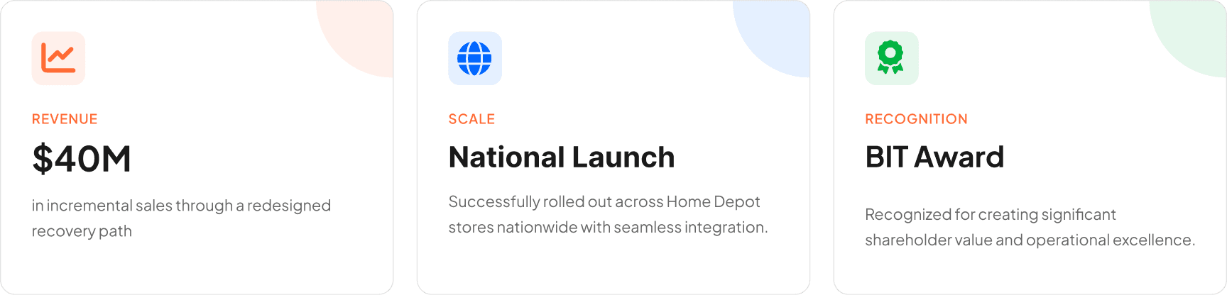
$40M
TL;DR・10-second version

**Due to confidentiality, some details and visuals have been omitted. Here are the key highlights.**
01
The Challenge
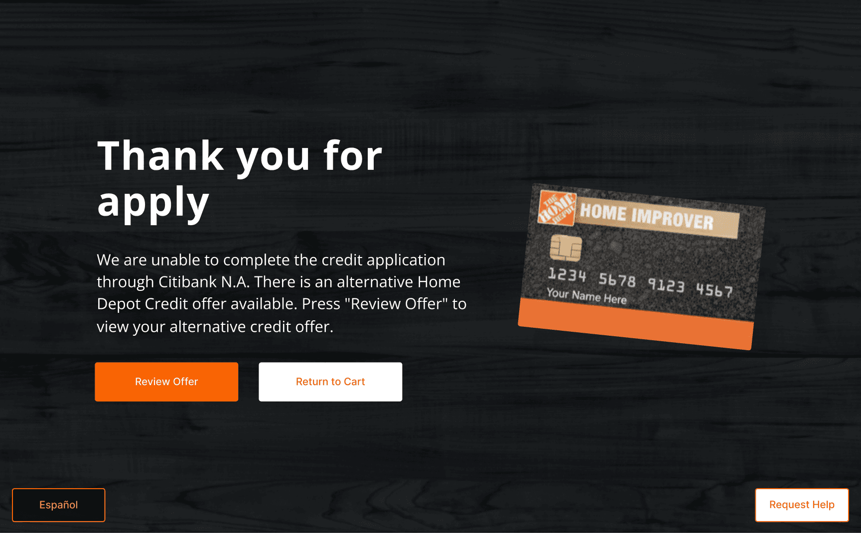
When customers were declined for the primary card at self-checkout, the experience simply ended. They were returned to cart with no recovery path, no alternative offer, and no way to access the sign-up savings that motivated them to apply.
That created two losses at once: customers hit a dead end after investing time in the application, and the business lost a chance to recover financing at a high-traffic checkout channel. The challenge was to redesign that moment into a compliant, self-serve recovery flow for a fast, public, unassisted environment.
02
What Made SCO Different
Second Look already existed in other Home Depot credit channels, but those flows depended on support systems self-checkout did not have. This was not a blank-slate invention problem. It was an adaptation problem: redesign an existing financing recovery path so it could work in a self-serve checkout context.

03
The Process
I started by auditing how Second Look worked in other Home Depot credit channels, mapping the path from decline to acceptance and reviewing the legal content tied to the alternative offer. I then combined associate research with stakeholder input to understand what would and would not translate to self-checkout. That made the support gap clear: existing channels relied on explanation, printed disclosures, and guided completion. SCO could not.
The research also surfaced the broader constraints shaping the solution: Store Operations needed minimal disruption to checkout. Engineering needed secure handling of sensitive customer data. Legal and compliance needed a valid disclosure path. The business saw a major revenue opportunity at SCO. That work set up the key decision in the project.

04
The Key Decision
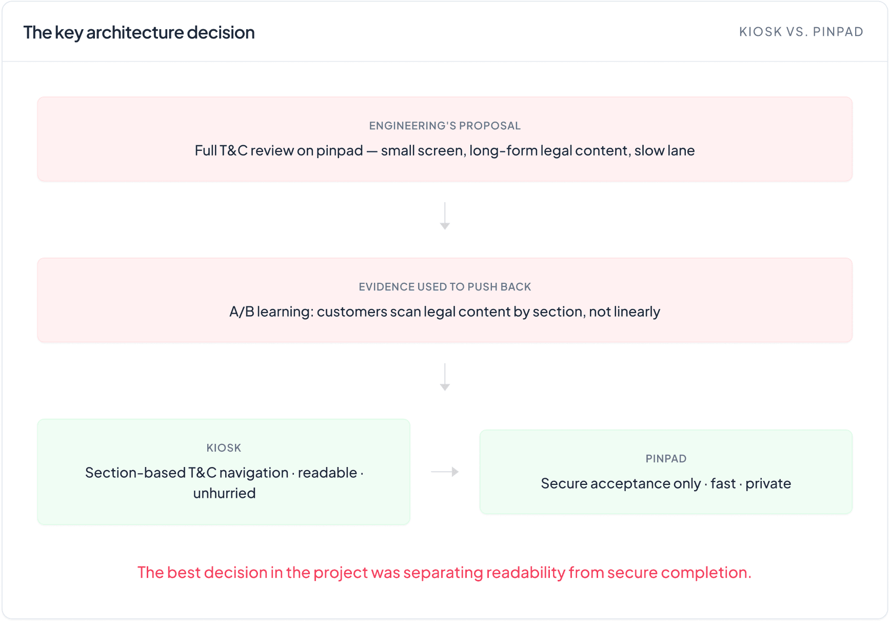
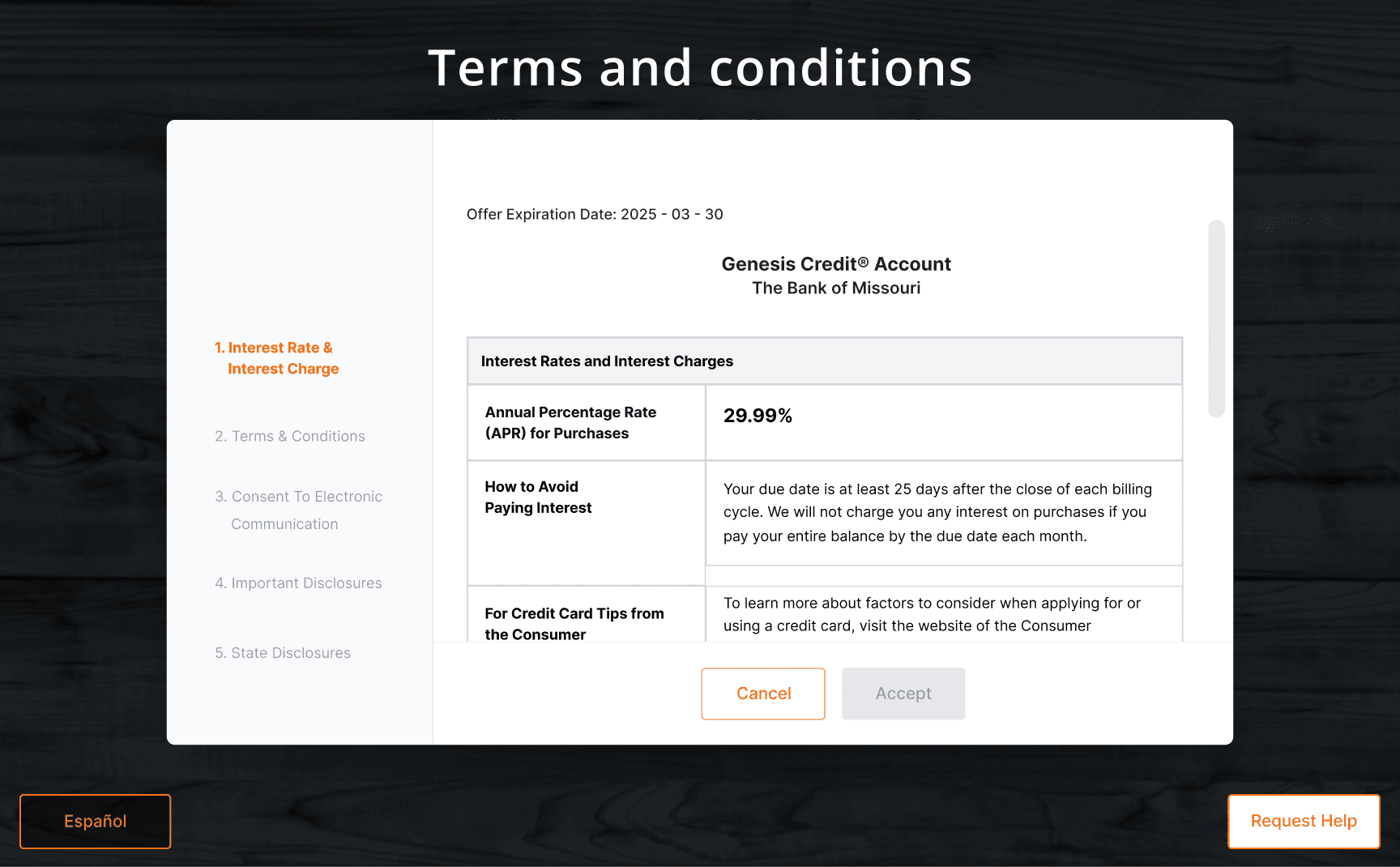
Engineering initially wanted full T&C review on the pinpad. I pushed back because the screen was too small for long-form legal content and created two risks at once: harder review for customers and slower checkout for the lane.
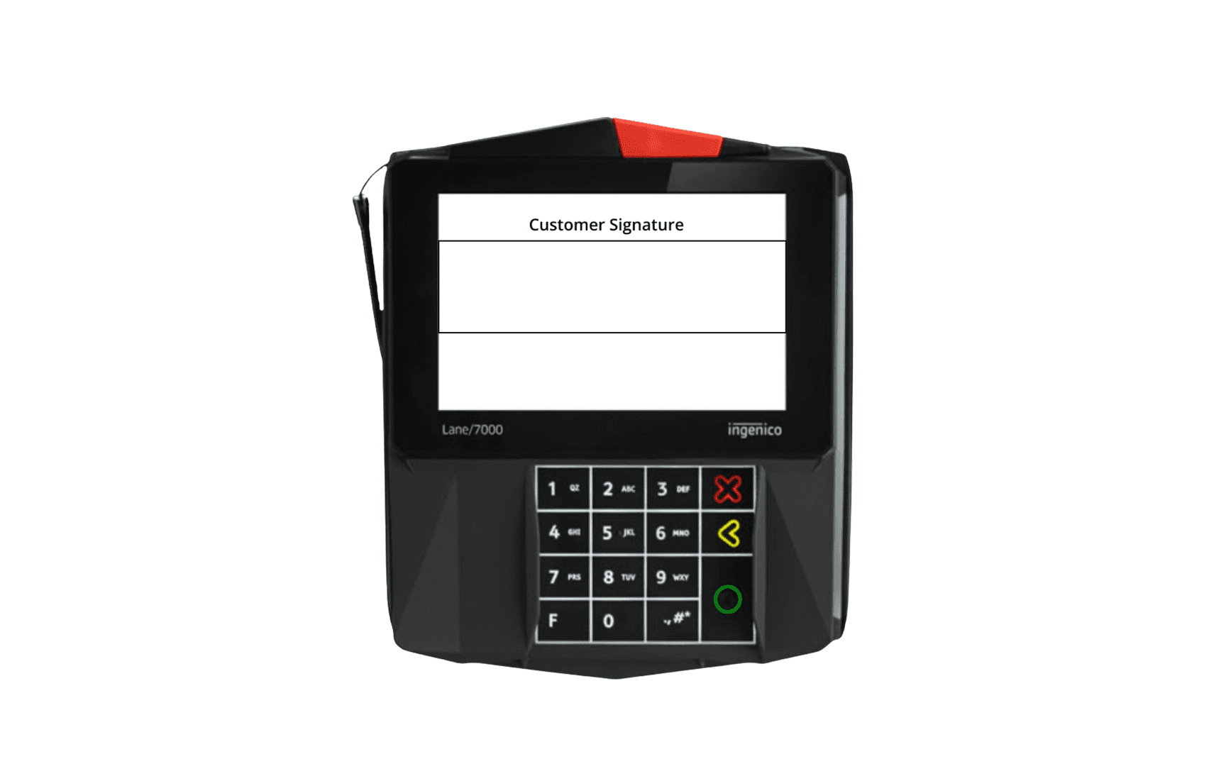
I used A/B testing insights to show that customers scan legal content by section instead of reading it linearly. That changed the direction of the project. The solution was to move T&C review to the kiosk, where I designed section-based navigation for easier review, then hand customers to the pinpad only for secure completion.
05
The Solution
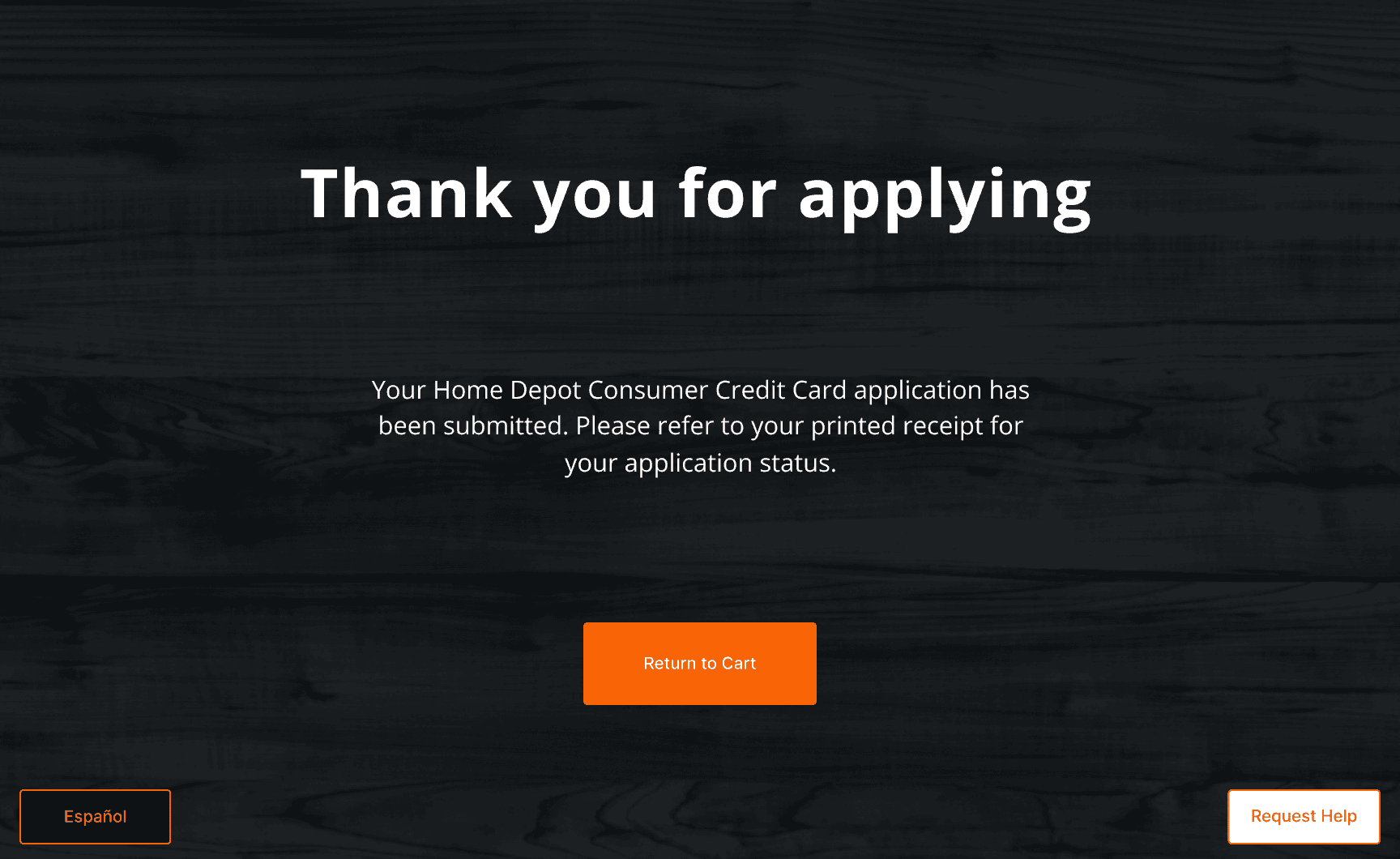
The redesigned flow did four things in sequence: intercepted the decline moment, surfaced the alternative financing offer, supported readable T&C review on the kiosk, and handed customers to the pinpad for secure acceptance. This turned a dead-end decline into a compliant self-serve path forward.
Decline recovery screen— intercepts the decline moment
Offer details screen — surfaces the alternative financing option
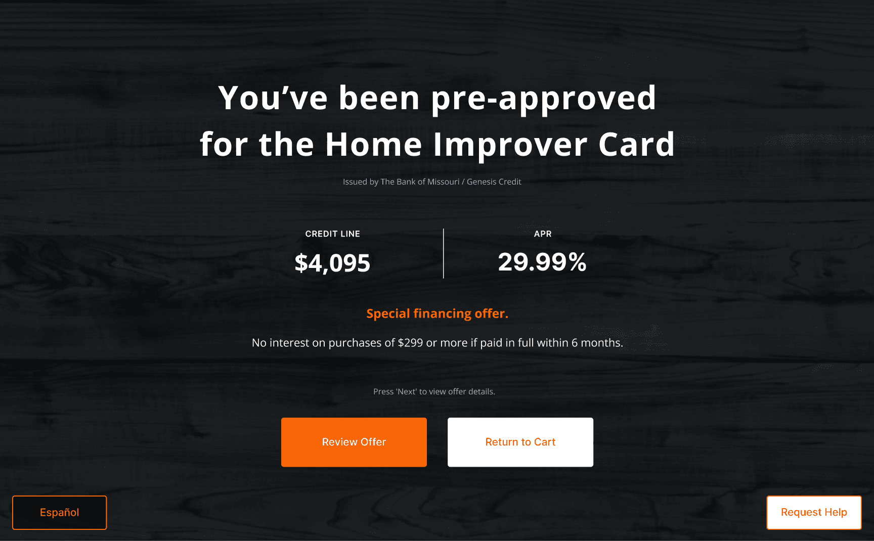
Kiosk-based T&C review — section navigation for readable legal review
Pinpad handoff — secure acceptance only, fast completion
06
Impact
The redesigned self-checkout recovery flow launched nationally and turned a dead-end decline into a $40M incremental sales opportunity, proving that better UX at a high-friction moment could create measurable business value.
07
Learnings
This project reinforced that the strongest UX decisions often come from understanding the system, not just the screen, and that in complex environments, research is as much a tool for influence and architecture as it is for design.
